
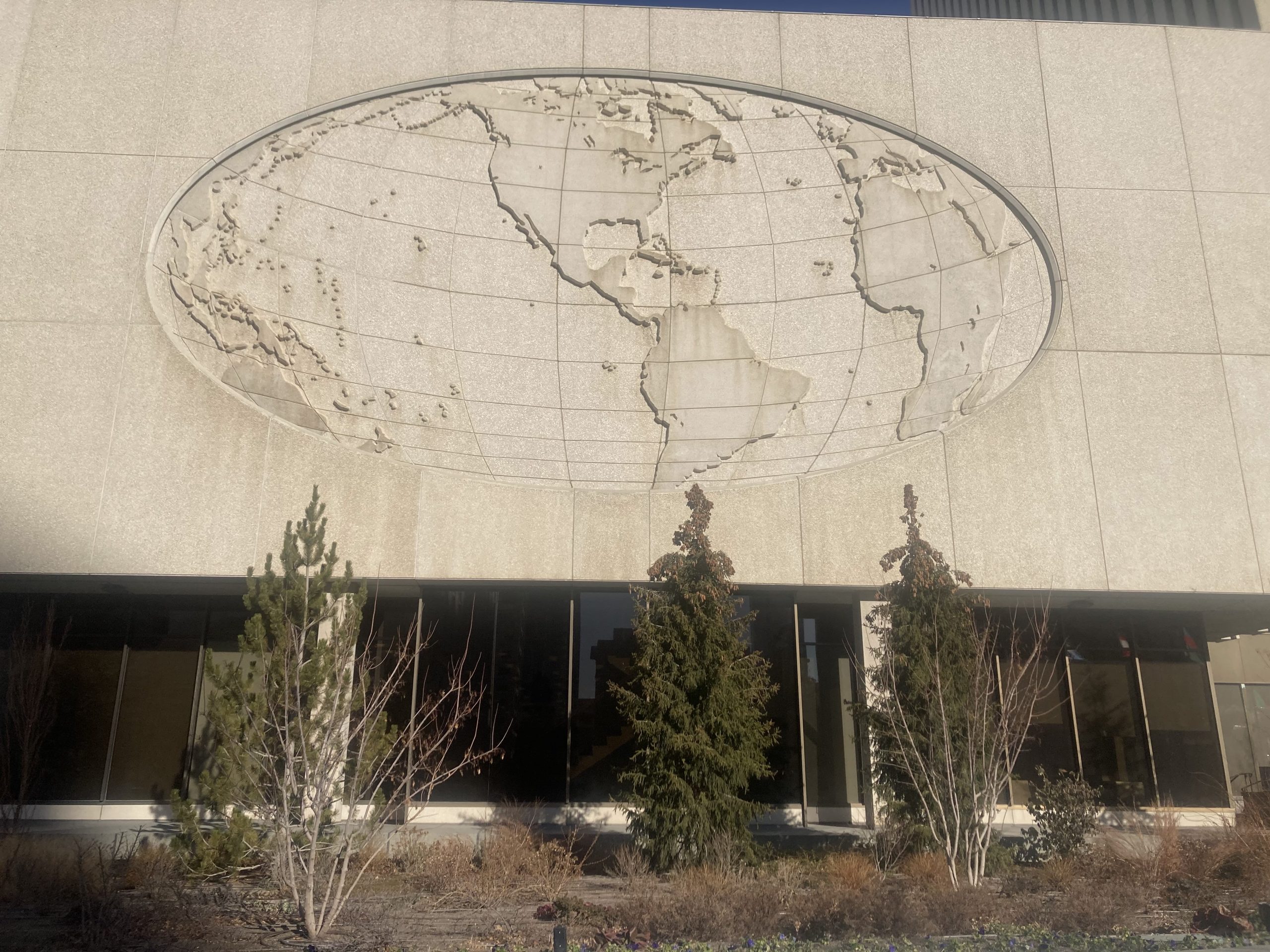
On the south side of the Church Office Building, a concrete oval world map relief flattens the Western Hemisphere into a stylized projection.
Fans of Aaron Sorkin’s The West Wing may remember the show’s famous jab at the Mercator projection, a map so ubiquitous we mistake it for neutral. Little could those viewers have known, back in the George W. years, how much that same projection would come to shadow a real West Wing two decades later. The Mercator projection—still the default in many people’s mental geography—bloats the poles so dramatically that Greenland can look Africa-sized, when it’s closer in landmass to the Democratic Republic of Congo. But Mercator isn’t the only strange way to slice the planet. In downtown Salt Lake City, the LDS Church Office Building wears two concrete world maps on its horizontal skirt—and neither one shows the whole world. Parts of Australia, vanish. India disappears. The western U.S. gets cropped. The result is less a “world map” than a worldview.
Plans for the Church Office Building, which became the city’s tallest building and dramatically altered the city’s profile, were first announced in 1960. Demolition of old buildings was begun in 1962, but construction only began in earnest as the first steel beams were placed in 1970, and the entire structure was finished in late 1972. The church’s new tower announced a bold vision, a corporate headquarters for an increasingly corporate church. It also announced its vision of a global religion.
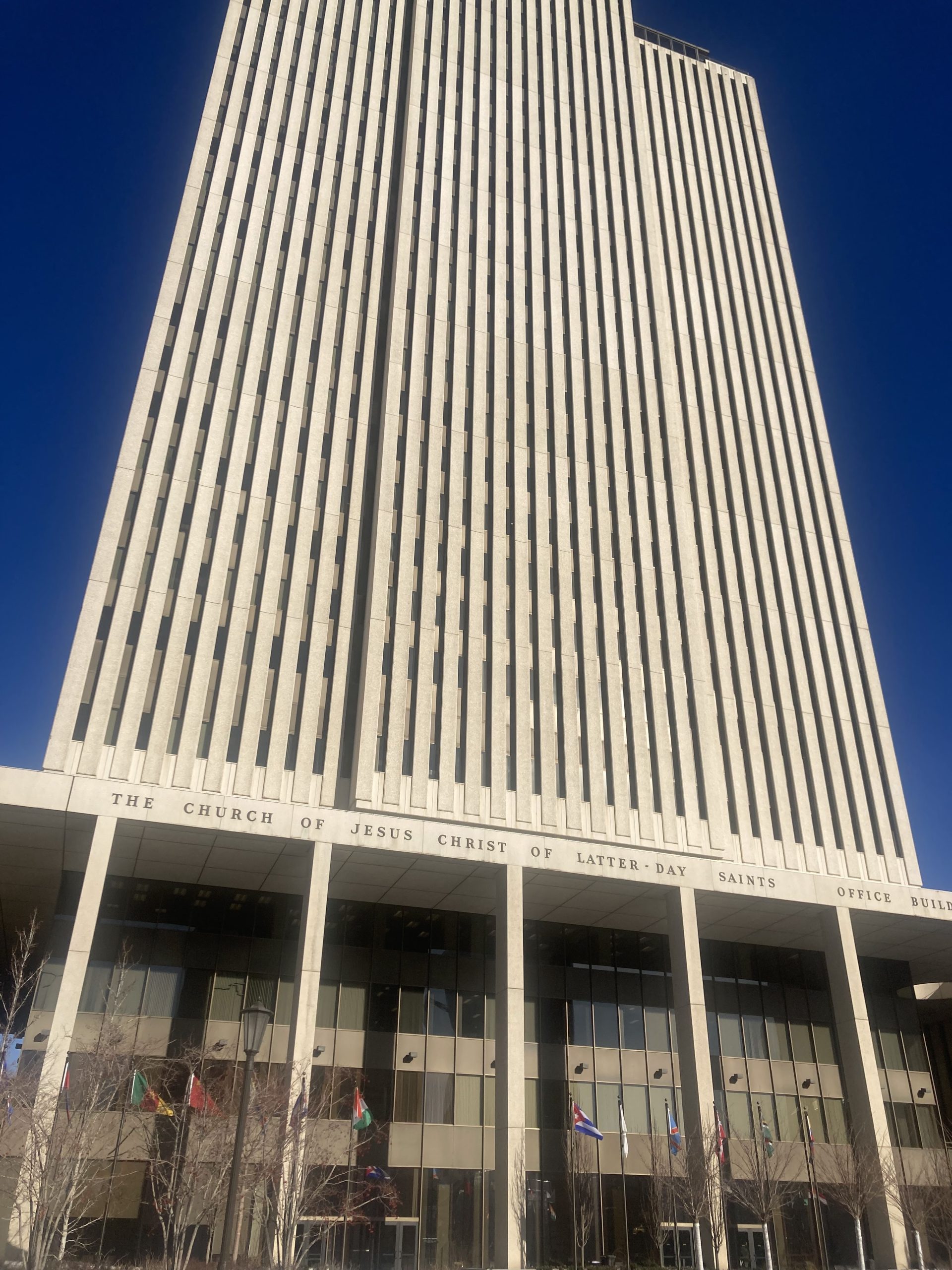
The LDS Church Office Building rises over downtown Salt Lake City, its modernist vertical ribs emphasizing height and authority.
Since its foundation, the LDS church had sent missionaries out to the world, but in the early days new converts were encouraged to “gather in Zion”—which after 1847 meant Utah. By the 1970s, as the church’s missionary numbers swelled and their membership numbers spiked, leaders told new converts to gather where they were—in “stakes of Zion” spread throughout both hemispheres.
The Church Office Building global maps, etched in concrete, were heralds of this global vision.
As artworks, the maps are both ancient and modern. In the postwar period, concrete wasn’t just a structural material—it was also a surface you could work. Architects and builders were using it the way earlier cultures used stone. Cast or carved concrete panels functioned like a modern version of ancient bas-relief—think of the shallow-cut narratives on walls from Egypt to Babylon to Angkor Wat, where figures and symbols are meant to be read in raking light as the sun moves across the day. Concrete made that kind of imagery newly practical. Instead of chiseling limestone or marble, artists and fabricators could form reliefs in mold and pour them in place (see Jo Roper’s wall at what was, in 1964, the “new” Salt Lake City library). The result is a kind of midcentury monumentality—modern in material, ancient in impulse.
At first glance, the maps at the Church Office Building look like decorative reliefs, the type of civic ornamentation you would find on a corporate tower. But the maps are also kind of odd, centering the world in unexpected places, compressing some regions, erasing others, and leave entire landmasses stranded at the edges. The Mercator Projection takes a world globe and stretches it to fit a rectangle, distorting the northern hemisphere. The church headquarter maps, by contrast, stretch the map into an oval, as if the globe had been run over and flattened, in a manner closer to a Mollwieide projection. Any meridian can be used to center such projections and the most common is the Prime Meridian (0° longitude) which runs through Greenwich, England. The church office building’s maps, however, are split in two, the western hemisphere on the north and south side of the west of the building and the eastern hemisphere on the north and south side of the east of the building. The eastern maps are centered longitudinally around 35 degrees east, creating an “Old World,” map, with Europe, Africa, and the Middle East occupying the visual center, while the Americas are pushed and stretched toward the left edge. North and South America become peripheral—partly visible, partly distorted—while much of the western United States disappears altogether. It is hard not to read this as more than a technical choice. It centers the map on a line that cuts through Jerusalem, quietly loads the relief with religious meaning—the world arranged around a sacred axis.
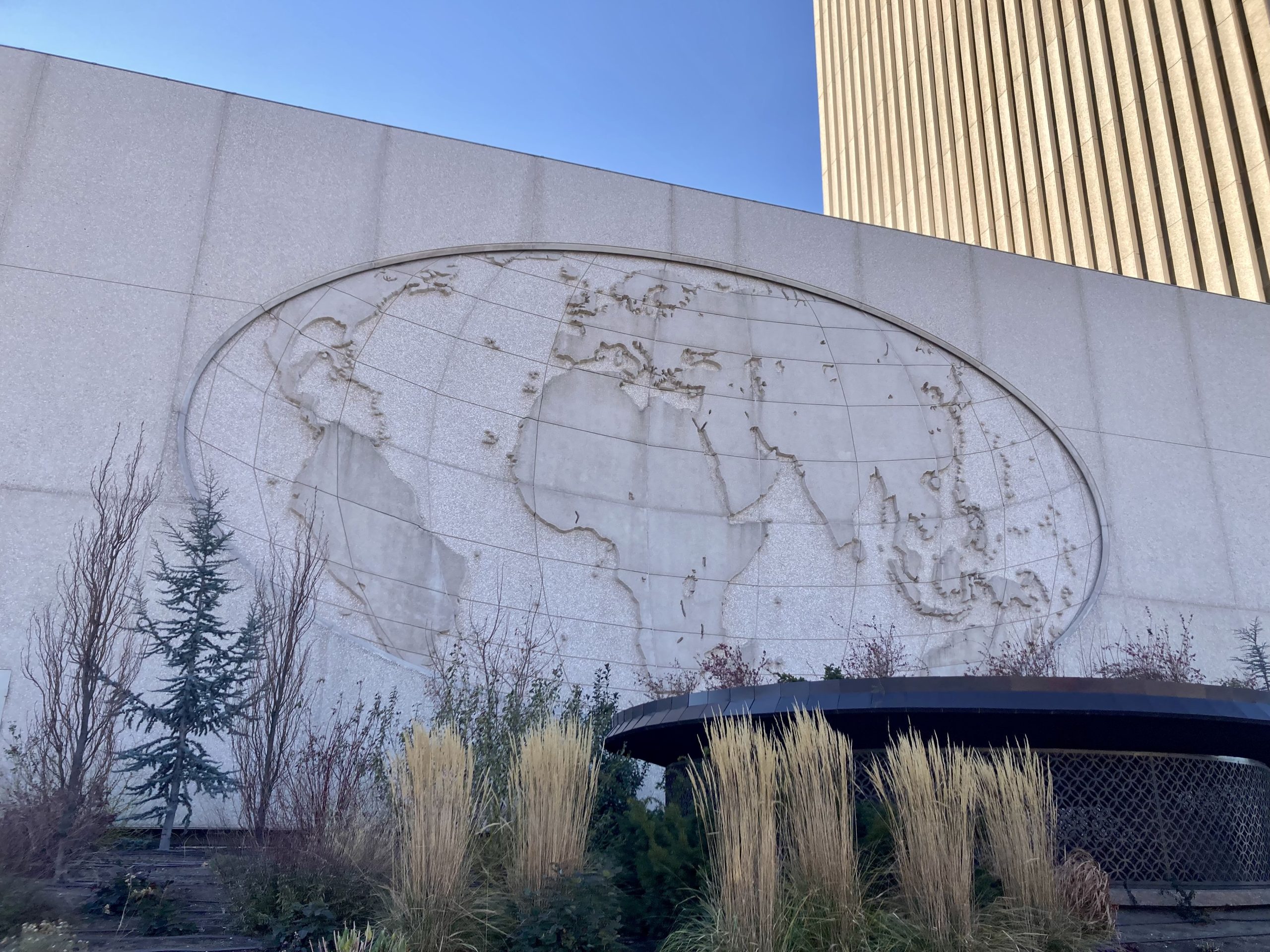
The north-side relief sits on the building’s horizontal base, a monumental cartographic panel set beneath the looming tower.
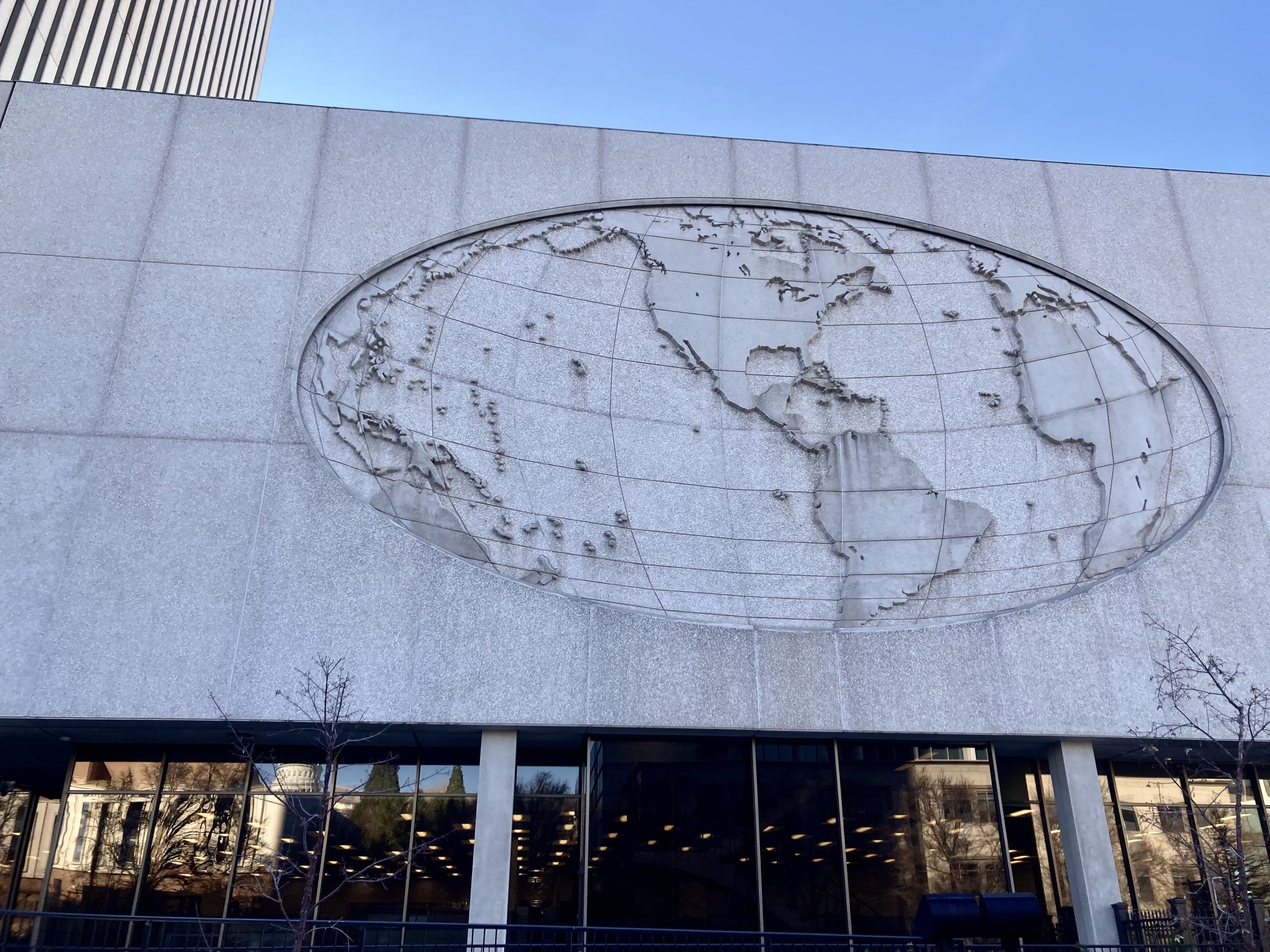
Map of the Americas seen from North Temple.
The western map, by contrast, centers the western hemisphere and gives North America pride of place. Even here, though, the center is not quite where you might expect. It is slightly east of the geographic center of the continental United States, which lies near Lebanon, Kansas. Instead, the map’s midpoint lands roughly 250 miles east, closer to the Kansas–Missouri border, along a different sacred axis. As early as 1831, Joseph Smith identified Independence, Missouri as a gathering place for the Saints; he also identified it as the past site of the Garden of Eden, and the the future site of a New Jerusalem, the capital of a redeemed world after the Second Coming of Christ. The Saints, however, were driven from Missouri and gathered in Illinois. Then, after Smith’s murder, Brigham Young led one portion of the restorationist movement west to the Rocky Mountains. But that return to Missouri, to build the New Jerusalem, has remained part of Mormon lore, if not always formal LDS doctrine—persistent enough that some members continue to invest in property in the region, anticipating a future homecoming.
Latitudinally, both maps are centered not on the equator or any other obvious line of latitude, but roughly halfway between the equator and the Tropic of Cancer—a band that runs across the top of South America, through the middle of Africa, and cuts through the tips of southern India and Southeast Asia. The choice was likely visual rather than symbolic. These reliefs are seen from below, and centering the map here makes the continents swell into the available space, increasing the sense of mass and presence. The tradeoff is that the far north and far south—Greenland and Patagonia, among other places—nearly vanish.
And yet the effect can also feel oddly prescient, even prophetic. In the decades after these maps were installed, Central and South America—near the centerline of the western map—became major regions of LDS expansion. More recently, Africa, which sits at the heart of the eastern map, has become a site of dramatic growth as well, with membership rising rapidly over the past decade.
For better or worse, we’ve all become more familiar with map projections in recent years—and with how they distort not only landmasses, but the way we imagine the world: where its center lies, where its margins begin, and who gets to occupy the foreground. The Church Office Building’s concrete reliefs make that distortion literal. They don’t simply depict the planet. They frame it.
All images courtesy of the author.
DID YOU ENJOY THIS ARTICLE?
Help make more like it possible.
VENMO us a donation at artistsofutah

Or use PayPal to MAKE A DONATION.
15 Bytes is published by Artists of Utah, a 501 (c) 3 tax-exempt nonprofit.

The founder of Artists of Utah and editor of its online magazine, 15 Bytes, Shawn Rossiter has undergraduate degrees in English, French and Italian Literature and studied Comparative Literature in graduate school before pursuing a career in art.
Categories: Architecture & Design | In Plain Site | Visual Arts






Oh please, what a ‘much ado about nothing’ or ‘Making a mountain out of a mole hill’ analysis of a global Church that is involved with doing Christ’s work around the world. What’s next on this authors’ list of meaningful ‘deep dives’ and ‘probing analysis’? Ooooh, perhaps he should waste our time in analyzing why missionaries that represent said global institution wear plastic name badges that are black?????? What does the ‘black’ really stand for, darkness? evil?, perhaps an underlying plot for worldwide enslavement? I’m sure that with this authors’ keen and skewed perspective he will unearth even more vapid and facile perspectives. Can’t wait for more of such ‘enlightened’ analysis!
Shame on you for publishing such a piece of dribble!
Shawn, more superb history. The hieroglyphs on Egyptian temple columns are inset, rather than raised like these maps, presumably in order not to spoil their clean silhouettes. Concrete is essentially limestone, and/but doesn’t carve, so how to create a bas relief with it is a fascinating challenge. I’ve looked often at those two maps and wondered about their layouts, but your theory, that they foregrounded important places in Church history, and compromised accordingly, makes sense of them. I’m going out on a limb with the possibility they also, as you propose, featured places that even then were of future interest to the thinking members. When did Central America assume importance in their speculations? Keeping your eye on the Past gives readers lots to think about!
This is brilliant! It’s always enlightening to ask, who made the maps?