When starting a painting, it is important that the first few values get put down on the canvas correctly before any other brushstrokes are recorded. I say value with the understanding that we are talking about color here — of course the color isn’t correct unless it is the right value, so for this discussion the terms will be interchangeable.
When choosing a first value, the artist must have a standard to choose from. In other words, just any value won’t do. That is why many artists choose a particular value scale to work with. Most use a 9, 10, or 11-step value scale to judge all the other values. You could use a 5-step value scale; its limited range is a great way to maintain simplicity in your design (which may be difficult to achieve when too many values are present). Many fine paintings use 5 values only, and the results are more than satisfactory. For our purposes here, let’s go with the 9-step value scale. I prefer this uneven number of steps because #5 is the exact mid value, and using anything more than 9 is just splitting hairs.
So, does this mean that you need to carry a value scale out into the field with you? Well, it’s not a bad idea, but not always necessary for a seasoned plein air painter. On the other hand, even the most experienced artists can become confused on location when there is a strong light and a lot of glare, like a bright sunny day in the snow, or working out on the beach with glare hitting you from all angles. For this reason I like to carry a small value scale with me and pull it out when conditions make it difficult to get a correct mental reading. (Note – laminate your value scale so you can check a daub of paint right on the surface and then wipe it off.)
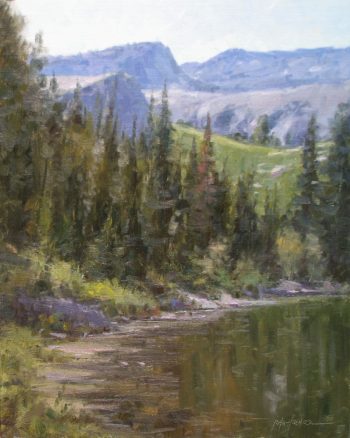
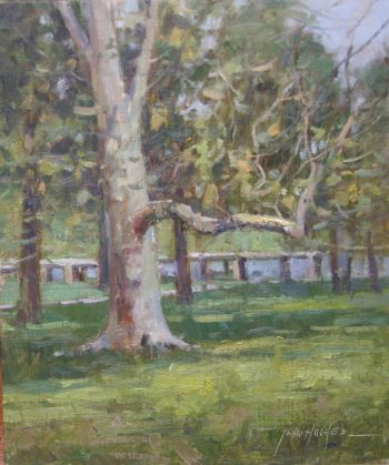
To begin with, it’s usually safe to lay in a few strokes of your darkest dark. The reason is simple — the darkest darks are easier to judge than the midtones at this stage of the process and it’s nice to have some transparent darks as the basis for a good composition. Remember, your darks hold the drawing and provide the weight of the design. This doesn’t mean that you can’t work on a midtone ground — let your subject dictate whether you start on a blank white canvas or a midtone wash — but getting those initial darks in right from the beginning of the design will keep you on the correct road. Once you’ve keyed in the first value, what then? The answer is to lay down a value next to the first one that looks right in relation to it, then another value and another….on and on. That’s a simple way to put it. It’s not the only procedure out there, but the one that all of the other procedures are based on. Yes, all other procedures are variations on this one…it’s all about relationships. So yes, you can work all over the canvas putting down one hash mark after another like the Impressionists, or start your painting with an overall tone like the “brown sauce school” of the Robert Henri tradition, but in the end you will be doing the same thing — relating one color to all the other colors on the canvas to achieve a certain amount of visual believability. You can test this process out on a small scale, doing a simple still life before wandering out into nature with all of its variety and see what I mean; at that point you will have some solid information to proceed on.
Once the initial correct value relationships have been applied to the canvas you can put away the value scale. Why? Well, now you are using the correct values on the painting itself to make your comparisons. Remember too that getting the look you want in a painting has as much to do with your drawing, color harmony, edge control and the quality of the brushstroke as it does with values; they all work together for the good of the whole. I think that most people who are just starting out in painting and a lot of art students who have been at it for a long time overshoot this critical understanding, thinking that painting is a matter of knowing how to paint “things” successfully. I often hear the question “How do you paint a tree?” or the statement “I want to learn to paint water better,” as though these things have a special way of depiction, separate and unique from all other painting solutions. For this reason we have an overabundance of paintings in this world that have miles and miles of viridian green lawns with those cutesy little blades of grass popping up out of the corners of their frames. Oy vey!!! Enough already!!! These kinds of solutions may be just fine for tole painting, but not for landscape painting; there has to be something more, a better understanding of what the painter’s job is. We are creating the illusion or better yet, a feeling about something by creating relationships in design, color, value, edge quality and brushwork that gives us a sense of place. Those relationships alone will create the illusion of reality without all the blades of grass that never say grass. From that point on any detail that is included makes sense because it is part of a greater whole which all start with – “The importance of judging values at the beginning of the painting process.”
DID YOU ENJOY THIS ARTICLE?
Help make more like it possible.
VENMO us a donation at artistsofutah

Or use PayPal to MAKE A DONATION.
15 Bytes is published by Artists of Utah, a 501 (c) 3 tax-exempt nonprofit.

UTAH’S ART MAGAZINE SINCE 2001, 15 Bytes is published by Artists of Utah, a 501 (c) 3 non-profit organization headquartered in Salt Lake City, Utah.
Categories: Articles | Hints 'n' Tips