Anyone who thinks he knows such an ultimate truth may stop reading here. Whoever believes she knows the proper task of art can click the arrow below that is the digital equivalent of turning the page. For the rest, the good news is that one of the most eagerly anticipated exhibitions of the 2014-15 academic year just opened at Weber State’s Shaw Gallery, and that it lives up to its co-curators’ desire to demonstrate the vitality of painting at this politically frustrating and historically dubious moment. Twenty-two large and precocious works of art have been assembled by Matthew Choberka and Lydia Gravis, who bring together artists from all over the country, employing familiar and unfamiliar approaches to painting that promise they will go the distance. Although some appear purely ‘abstract,’ and others present recognizable ‘images,’ they are all ‘representational’ in the sense that each represents one artist’s venture into a meaningful life. Everyone wants to find a purpose in life, even those who, convinced it has none, settle for demonstrating its lack. But art is only a possible choice for those who wish to share their search or their conclusions. Pure Paint for Now People strives to be a glossary, if not an encyclopedia, of current ways of painting. To that end, no single metaphor can describe its contents.
One metaphor without which I find it increasingly difficult to talk about today’s art is strategy. Where for most of art history an artist went into the studio knowing what the job required—national myth, historical precedent, individual significance, mundane experience—today an artist’s first challenge is to conceive or discover a unique, personal approach to interest an audience. In trying, while contemplating a work, to identify its maker’s strategy, I am trying to project myself into the individual artist’s experience, to read minds one at a time. Here two of them, Choberka and Gravis, describe in their introduction the conundrum as they know it—as the common property of their tribe:
The act of painting has, for several generations, been understood to, on one level, be concerned with understanding and defining itself: to be a form most relevant when all hopes for relevance are abandoned, when it makes no claim to address life as it is lived or to reflect larger concerns in the culture. Painting thus turns inward, seeking purity and autonomy.
But, as their exhibition title—Pure Paint for Now People—suggests, they actually reject the part of that statement that represents someone else’s conclusion. There’s nothing pure about painting as they see it. Rather, it’s contingent, and autonomy belongs to theory, something that accumulates beneath the east end of a cow watching the sunset while chewing its cud.
Take Hannah Barrett, for instance. “Summer Shepherds” violates most of the rules of realism, as distilled by centuries of painters in a process that climaxed in the 19th century. Its visual realm is flat, so that the pouring figure has to twist her hand across, rather than around, the teapot, while the parallel lines on the blanket decline to converge in the distance, where tiny sheep are presented stiffly sideways, the way Stone Age cave paintings or Egyptian tomb friezes show them. These choices are intended to call our attention to others, like the deliberately ambivalent clues given by costumes and coiffures. While the image harks back to a bucolic age, an Arcadian ideal symbolized by peaceful agriculture, the painter looks forward to the ongoing creation of a similarly idyllic time for gender conflicts: a time when identity will be free of preconceived notions of reproductive status determining fate. In case it’s not clear that she sees this as a sunny future, note the cloudless sky, its cast light unperturbed by shadows. So much for the notion of irrelevant painting, lost in solipsism and indifferent to cultural concerns. This is painting with passion: art that in many places could get you killed.
By no means are all the works controversial in just this way. That would be another show, perhaps one with ‘engaged’ in the title. A substantial portion of today’s strategies start with technique. Jennifer Meanly speaks about the intersection, in her work, of painterly practice with printmaking, collage, and installation. You could say she works in figurative assemblage, pausing first to create her raw materials on the press before collaging them into paint. BYU alumnus Jason Metcalf, recently conspicuous on the local gallery scene, undertakes to fashion a forgery: i.e. a preparatory or explorational drawing, a part of traditional painter’s process that might have been a step on Sidney King’s journey to Kolob, the vast mural he created for the Chicago World’s Fair that now resides in the Temple Square Visitor’s Center. Here one can imagine two opposing crowds of demonstrators: one arguing that religious proselytizing cannot qualify as art, the other that messing with a Mormon masterpiece is mockery. It seems to be human nature to squeeze out the middle in such a pursuit of extreme positions.
Gianna Commito undertakes a self-assigned task that challenges one of the fundamental assumptions of the art market: that each strategy stands apart as a necessary next step. Rather, she reflects on the errors of her predecessors, corrects them, and in the process fine- tunes contemporary history. In “Stow,” she shows how stripes, a staple of decorative pleasure as well as a onetime key player in the insurrection against traditional painting, can help reconcile the pleasures of paint and sculpture, 2-D and 3-D, object and image. Meanwhile, new uses for the power of time to comment on the present are not limited to Barrett’s gender-neutral future. Tia Factor’s “The Farm” contemplates the nature of social idealism through the fate common to so many Utopian communities, while Caleb Weintraub’s “Spooky Action At A Distance” (an actual, scientifically-recognized principle worth Googling) proffers not so much a future as an alternative to now that is part real past and part future in which the same experiences have different meanings.
A future in which the same meaning-infused objects still possess significance, and therefore value, because, as they must, the meanings have been changed and renewed, is as good an explanation as we’re likely to find for why artworks last while so many other human products fade. For the art lover who has tired of standing in the gallery and shouting at the deaf surroundings ”You’re not doing it right,“ here are 22 artists who agree, and who show themselves willing to keep trying, committed to the belief that it is still possible to get it right.
Caleb Weintraub’s “Spooky Action At A Distance”
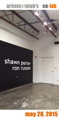
Pure Paint for Now People, curated by Lydia Gravis and Matthew Choberka, is at the Mary Elizabeth Dee Shaw Gallery on the Weber State University campus through April 10.
|
|
Exhibition Reviews: Salt Lake City
50 Shades of Red
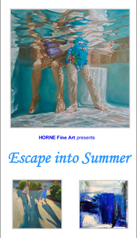
Horne Fine Art and Sprague Library Exhibits Examine the Color Red
by Ehren Clark
Art critic Clement Greenberg once said that “…for Western art in its Modernist phase ‘purity’ has been a useful idea and ideal, with a kind of logic to it that has worked, and still works, to generate aesthetic value and maintain aesthetic standards as nothing else in our specializing culture has over the last hundred-odd years.” (Arts Magazine, December 1976) Purity, for Greenberg, was about a reduction to the most fundamental aspects of an art — be it the purity of a two-dimensional surface, or to the pure contemplation of color. But in a post-Modern context, the study of color can be taken much farther, as it can be appreciated not only for its formalist realities and purity, which is now a well-established concept of art aesthetics, but from heterogeneous points of view, from different artists, with different modes of expression, to the extent that the very essence and truth of the possibilities and potential of color itself can be considered; which is what two group exhibitions in Salt Lake City this month — Horne Fine Art’s Exploring Red and Sprague Library’s Seeing Red — help us to do.
A literal expression is always a safe ground to begin any exploration, and at Horne Fine Art Susan Jarvis gives the viewer this in “Picante,” a canvas that presents a grouping of common, everyday, Harmon’s-City-Creek-readily-available, red picante peppers. In the produce section at Harmon’s, red is imperative for quality — for what is ripe, maybe underripe, or too much so — but in this painting, in an artistic context, the quotidian value of color is superseded by the aesthetic, which here denotes many essential and intrinsic —literal— understandings of red: intensity, fire, heat, passion, zest, vibrancy, flavor, spice…even energy, passion, and lust. In an art context, the value of the quality, so taken as a commonality in everyday vernacular, becomes explosive.
An interesting approach in any exploration of a color is a psychological one, to either a quotidian understanding, or to an aesthetic one; but the two cannot be compared in the value of depth reached by the latter. Portraitist Jeffrey Hale’s contribution to Exploring Red is “Huntress,” and the psychological implications are surprising. The huntress peers in from the left side of the panel. Her hair is raven black, as are her brows, and the lining of her eyes. Her hair, which is structural, forms a linear framing to her face rendering a bold and even cold, frontal gaze, accentuated by her neck, which is slightly strained in this “peering in.” The lips, which are a mauve tone of red, are slightly callous in the protrusion of the lower lip: it lends her a distinct air of indifference. What matters most are her eyes, which are as indifferent as her lips suggest, but hardly vacuous, and suggest assertiveness and direct conflict mingled with an accusatory expression of an inner state of personal pain. Almost 50% of the canvas is Bordeaux red—deep and assertive red, an aggressive red, a red that would suggest conflict and accusation if it could, and a red that would, if given human form —the very symbolic expression here — suggest an inner state of personal pain.
In the same space, David Maestas shows us that inner states can be explored without the use of representation, and his use of abstract expression is an exciting place to explore the possibilities of color. In “The Red Dress” — a title not to be taken as a representative comparison but as a jocular reference by the artist — red has a potent and substantive usage. On the very tall, vertical canvas, are three primary vertical zones of color and tone. On the left is pure white with some minimal tonal variation and on the far right is black, again with slight tonal variation. These two binaries seem to be in a state of conflict, one overpowering the other. Yet centrally, between this terrific energy, is a vertical plane of red, taking on, in this particular aesthetic context, entirely new values. This is a very personal red, as is the color of blood, the life substance of all humanity. The color denotes sensitivity, humility, and human suffering and pain, as it is bearing from both sides, at odds impossibly strong, a duality of light and dark. In this context, the color of red takes on epic proportions of humanist value.
One of the most open and liberal expressions of red in these exhibitions is by artist Madison Briggs, in a series of encaustics that share the same palette. Hers is an interpretative approach, allowing the viewer an equal liberality of license to explore red on their own terms. An interpretive approach may see the exotic nature of red in its brilliance compared to the vibrant orange, or the ethereal quality of red, as a familiar sight in a sunset, but recognized as such when compared with the rich azure blue in these encaustics. In this interpretive manner, the viewer might, through the same process, discover less concrete qualities and recognize various emotive, imaginative, creative, harmonic, even dissonant sensibilities aroused in these small creations, super-charged with potency for alternative sources of inspiration of red.
A last exploration from Exploring Red is Karen Horne’s “Invitation to Dance,” a narrative painting in which the color acts as a key player in the unfolding of the episode, occurring in subtle gestures and nuances, registering sensitively and boldly, simultaneously. In the narrative, the male dancer takes the woman’s hand, inviting her to dance. This is an occurrence that is palpably witnessed, not only by those in the audience, who sit entranced, but by the viewer, who is allured by the intensity of the moment in this subtle provocation. The red in this moment is imperative. It creates the kinetic energy of the female dancer, and creates cohesion to the suspense of the women in the audience, many of whom wear red. In short, red is the galvanizing factor to the narrative itself.
The dramatic power of the color is no less evident at Sprague Library, where Toni Youngblood’s “Red Winter Sky” expresses an immense sense of formal drama. It is shaped architectonically in a wooden tabernacle frame, which complements the intensity of the painting. In it is a linear silhouette of bare tree branches upon which two birds, one higher up, two lower, sit. It is bold and starkly set against a red winter sky. The linearity of black, and the ground of red, which shifts in tones from orange to red, is a formalistic approach, using color for its elemental structural values. If one stops to consider this formal value of red, and considers the modes of expression already mentioned — literal, nonrepresentational, psychological, interpretive or compositional — one finds that each is absolutely applicable to “Red Winter Sky” and the application of either one, several or all of these aesthetic expressive modes of utility of the color red only enhances the aesthetic sensible responsiveness of Youngblood’s painting.
Another piece, more challenging to this theory, is “Don’t Wear White or Else” by Sue Martin. In front of a white background and full green apple are placed a red apple sliced in half and placed frontally so that only a sliver of red shows, and, to the right, another slice of apple that reveals only a thin crescent of red. Again, considering the painterly elements alone, color is used for its elemental structural values of form, and not for conceptual, emotional, spiritual, or any other sensible responsiveness. Yet, given the utility of red, and again, applying one, several or all of the expressive modes, the painting is elevated to levels of sensibility unthinkable to a purely formalist approach.
Color has always been and remains one of the key components of art, especially two-dimensional art, and as these two exhibits show, possibly no other color has the power to act formally, psychologically and emotionally as red. While the hue’s appearance in Sprague Library’s Seeing Red seems to act on a more formal level, as a rhetorical device to hold together a group show of seven disparate artists, Horne Fine Art’s Exploring Red takes a more qualitative approach. The works appear more expressive, taking the subject beyond the realms of physicality, and into territories of true artistic reality.
Seeing Red: Works from the Wasatch Women Artists' Collective is at the Sprague Branch of the Salt Lake City Library through March 13.Exploring RED, a group invitational, is at Horne Fine Art through March 14.
|