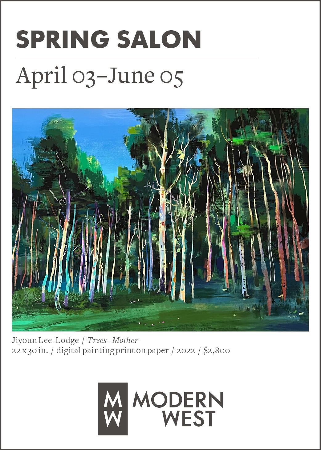
“Lincoln Park Arboretum,” oil & acrylic on panel, 40 x 70 in.
“Lincoln Park Arboretum,” one of eight multi-part and five single-panel paintings at Phillips Gallery, sets up a paradigm and writes subtext for all 13 paintings. The celebrated arboretum was presumably the focus of a visit to Seattle by both Joseph and Melinda Ostraff, she in her role as ethno-biologist and he as a painter whose life’s work, with its close association between the places he visits and the art that follows, serves as a kind of visual memoir, if not a curriculum vitae. But it’s not enough to say that nature exerts an influence on these paintings. This multi-layered abstraction, with its four rows of seven connected, yet distinct, panels, displays the form of a calendar, suggesting a month of days, with each day’s events leaving a unique impression on the mind and eye of the artist and recording a memory of something he experienced. “Boom,” a kind of companion or bookend to “Lincoln Park Arboretum,” repeats the pattern, but with more repetition: concentric targets that effectively line up across the 28 individual parts to suggest a goal, or an arrival in time as much as in place. After all, as Einstein saw it, time is the fourth dimension of space.
It seems there’s an informal school of art-making that, while it may not have been invented in Utah, has reached a high degree of development locally, as some artists work in it exclusively, while others are clearly influenced by it while working in other genres. This approach combines two popular techniques, abstraction and collage, that contrary to common assumptions are not historically linked, but here become unified into a single, eloquent voice. Ostraff may be its foremost proponent, and a close look at these works reveals its salient features. The most important of these is layering, which instead of conventional perspective gives the works an actual third dimension. In “East Wind.1” and “East Wind.2” this takes an extreme form, where the artist has laid down several independent images, each in successive layers, and then chiseled through the upper layers to create rough windows into the past, through which the lower or earlier layers are revealed. In other works, thick line drawings are covered by thin layers that disclose what lies beneath in the form of relief features. These texture details, by the way, are often missing in professional photographs, where even lighting washes them out: it’s one of the reasons this sophisticated art must be seen in person if it is to be seen at all.

“East Wind .2,” oil & acrylic, 33 x 30 in.
It’s worth repeating here that these are not depth “cues,” such as appear in illusionistic art. No converging lines or drawn shadows. The overlap is real; the parallax, when it occurs, is real. And the experiences they refer to, while not specifically designated, are also real. The past underlies the present, and the present the future. Foundations, often concealed, underlie everything we see. We dwell amidst facts that are sometimes visible but more often invisible, yet implicit and deducible all the same. The art lies in making these realities as vivid and visually satisfying on the canvas as they are compelling in life, with their connections more apparent. Ostraff is a master of handling textures in layers, so that while the shimmering ivory recorded in “Boom” is visible through the red it passes beneath, it sometimes vanishes under smooth black or gray: the surface may conceal or misrepresent what lies beneath, just as memories are lost or distorted, even with someone who travels deliberately and may take extensive notes on what is seen.
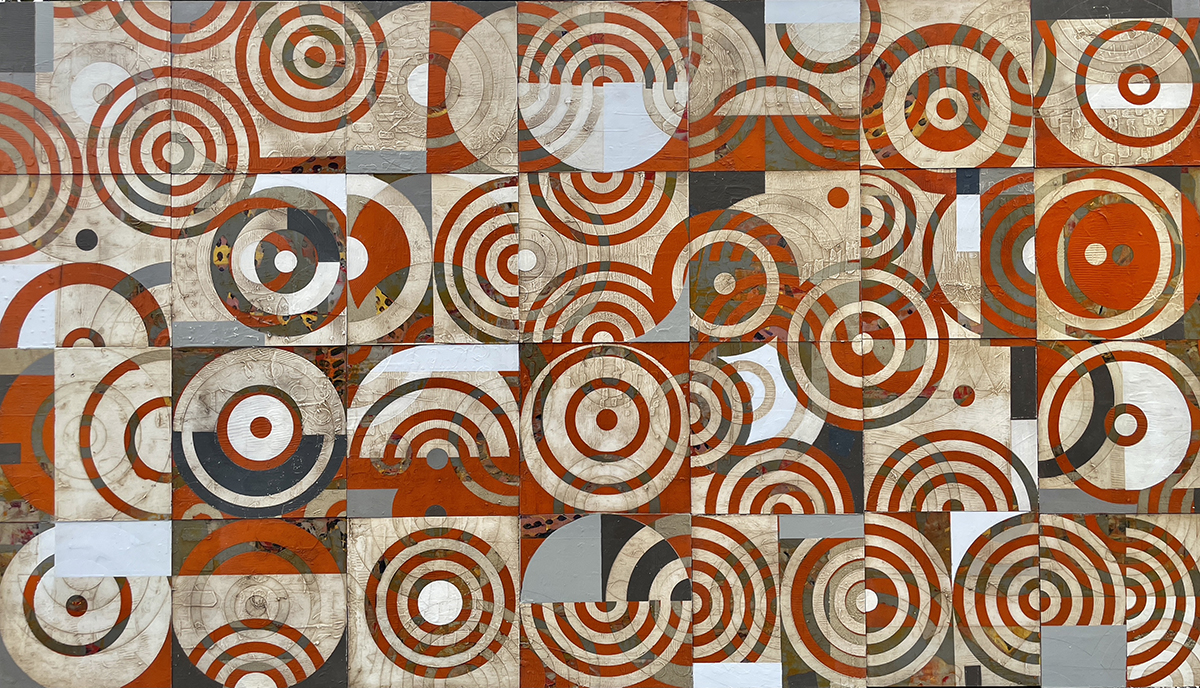
“BOOM!” oil & acrylic, 40 x 70 in.
Looking over Ostraff’s body of work, certain traits emerge. The flatness of his treatment combines with a frequent, heavily worn look to invoke old and weathered buildings or signs, or both: signs painted on barns and public places in the decades between universal literacy and the primacy of the digital message come to mind. A musician will know that minor keys are richer than major ones, and so, too, the darker, more troubled images that emerge from carving or sandpapering away newer paint to reveal old suggest more troubled stories. The “Wendover” paintings, for example, invoke a whole raft of minor, even trivial historical points. There are two contiguous Wendovers, one in Utah and one in Nevada, the second built to exploit the libertarian laws of Nevada after the first one lost the economic primacy it achieved when the railroads ruled the vast, empty West. Even the name, possibly taken from a railroad employee, has an air of uncertainty. Went over? West hover? Rusting away just outside of town, the remains of the airfield where bomber crews once trained to drop the Atom Bomb are too expensive to maintain, yet still indispensable to a vanishing generation of history buffs. Such things remain in limbo, waiting out benign neglect until they will be allowed to crumble, to be recalled then only by a handful of mysterious, richly suggestive paintings.

“Wendover.3,” oil, 31 x 36 in.
Ambiguity places its part here. “Wendover 3” sports a field of holes drilled into its skin in a grid formation. While their patina and individual differences suggest an industrial function, the pattern brings to mind charts and graphs, or even a bullet journal. While they’re apprehended by the eye, they are felt just as fully by the tactile senses. The painted shapes, including a field of pentagons that resemble so many Monopoly houses, feature silhouettes that change identity depending on where the eye falls. It’s quite likely that these compelling puzzles refer to random sights that caught the artist’s eye.
Another graphic reference is to the alphabet. Like major and minor scales, letter forms are paradoxical. According to neuroscientists, upper case letters lack distinction and are harder to read, offering only squarish profiles, while lower case letters, with their upstrokes and downstrokes, dots and crosses, are more legible to the eye and brain The specifically lowercase o’s, u’s, and l’s invoked variously here demonstrate, if nothing else, the lateral paths and horizontal connections a creative mind can take on the way from a chaotic, daily experience to a sustained, satisfying visual response.

“Lower Case L 2,” oil on panel, 36 x 36 in.
Joseph Ostraff, Phillips Gallery, Salt Lake City, through Nov. 12.
DID YOU ENJOY THIS ARTICLE?
Help make more like it possible.
VENMO us a donation at artistsofutah

Or use PayPal to MAKE A DONATION.
15 Bytes is published by Artists of Utah, a 501 (c) 3 tax-exempt nonprofit.
Geoff Wichert objects to the term critic. He would rather be thought of as a advocate on behalf of those he writes about.
Categories: Exhibition Reviews | Visual Arts